LINEAR PILATES
Concept Branding Identity

LINEAR PILATES
Concept Branding Identity
Client
Concept Work
CREDITs
Personal Project
Year
2026
ROLE
Designer + Creative
Pilates branding often lives in a neutral, minimal world. It's awash with beige and gentle visual cues. But the members at Linear Pilates are anything but beige.
Linear believes strength is built, not found. Their method follows a purposeful, linear progression designed to take you from your current threshold to your next peak in a single, unbroken series of moves.
At Linear, members don't just exercise, they evolve.
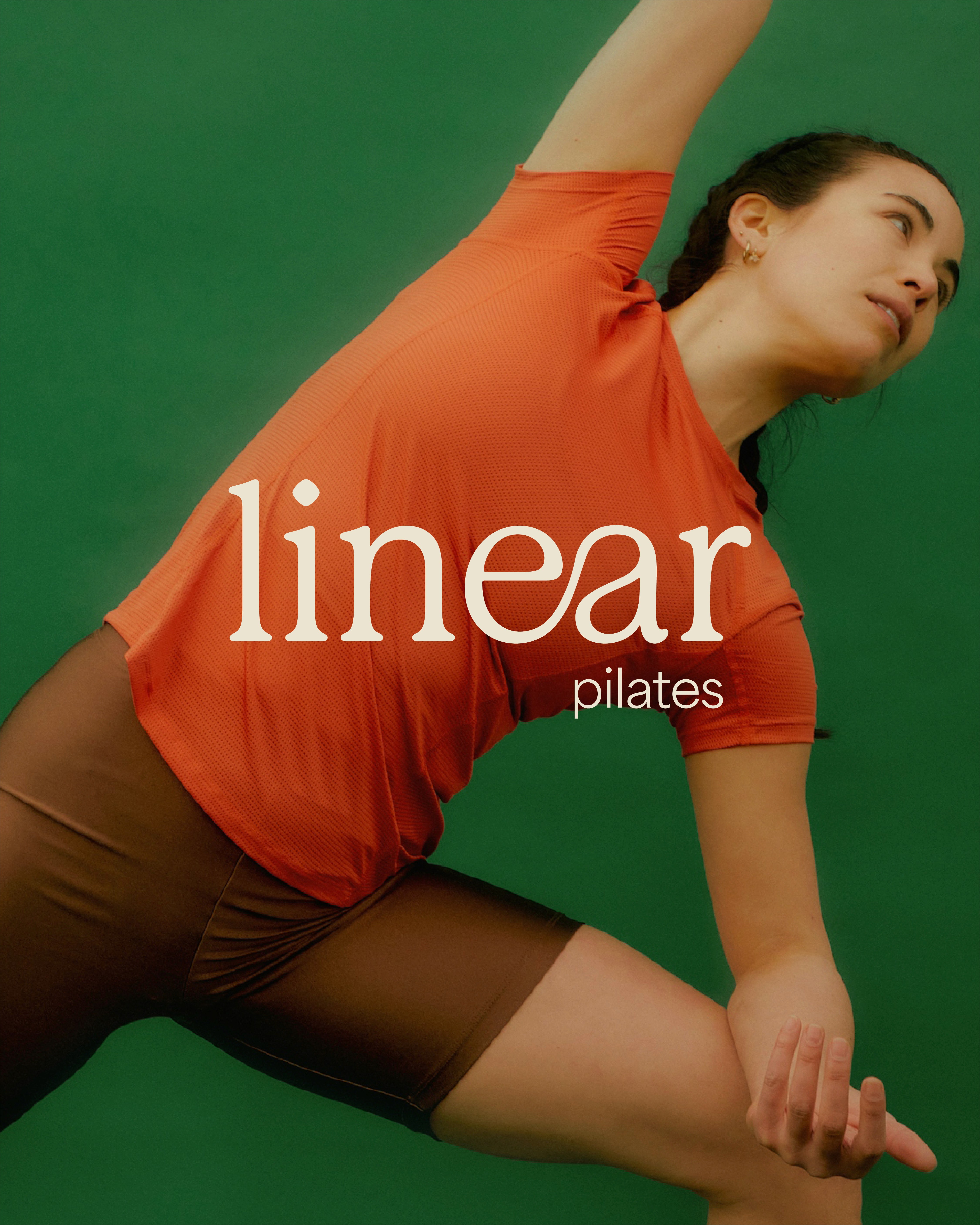
Using a warm colour palette, I chose a warm vermillion for drive, set against an earthy green, the ground members build their strength from. Members reflect this duality. They are grounded but strong. The logo employs an old style serif that maintains warmth through its rounded terminals. Building upon layers, the connected letterforms show the flow of a pilates sequence.
Pilates branding often lives in a neutral, minimal world. It's awash with beige and gentle visual cues. But the members at Linear Pilates are anything but beige.
Linear believes strength is built, not found. Their method follows a purposeful, linear progression designed to take you from your current threshold to your next peak in a single, unbroken series of moves. At Linear, members don't just exercise, they evolve.
Using a warm colour palette, I chose a warm vermillion for drive, set against an earthy green, the ground members build their strength from. Members reflect this duality. They are grounded but strong. The logo employs an old style serif that maintains warmth through its rounded terminals. Building upon layers, the connected letterforms show the flow of a pilates sequence.
Client
Concept Work
CREDITS
Personal Project
Year
2026
ROLE
Designer + Creative
Pilates branding often lives in a neutral, minimal world. It's awash with beige and gentle visual cues. But the members at Linear Pilates are anything but beige.
Linear believes strength is built, not found. Their method follows a purposeful, linear progression designed to take you from your current threshold to your next peak in a single, unbroken series of moves. At Linear, members don't just exercise, they evolve.
Using a warm colour palette, I chose a warm vermillion for drive, set against an earthy green, the ground members build their strength from. Members reflect this duality. They are grounded but strong. The logo employs an old style serif that maintains warmth through its rounded terminals. Building upon layers, the connected letterforms show the flow of a pilates sequence.